Data is no longer just numbers — it’s the key to smarter decisions. Discover the top data visualization tools transforming analytics in 2026.
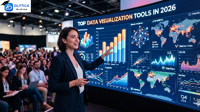
What is Data Visualization?
This data visualization guide explains how raw data is transformed into meaningful visual insights using charts, graphs, and dashboards. Data visualization helps businesses and professionals quickly understand trends, patterns, and decision-making opportunities hidden in complex datasets. In 2026, it has become one of the most important skills in data analytics and business intelligence.

Common Types of Data Visualization
-
Comparison (Bar charts, column charts, radar charts)
-
Distribution (Histograms, box plots, scatter plots)
-
Relationship (Scatter plots, bubble charts, heatmaps)
-
Composition (Pie charts, stacked bars, tree maps)
Why It Matters for Your Career
Data literacy is now one of the most in-demand skills globally. Professionals who can read, create, and communicate with data visualizations are significantly more effective at influencing decisions, securing stakeholder buy-in, and driving business value — regardless of their role.
Why Data Visualization Matters More Than Ever
The explosion of big data has reshaped how businesses operate. From marketing performance and customer behavior to financial health and supply chain dynamics — every function generates massive amounts of information. The true value lies not in data volume, but in how effectively it can be interpreted and acted upon.
Key Driver: Democratizing Data
In 2026, visualization tools are empowering business users, marketers, analysts, and executives to explore data independently — without relying on IT or data science teams. Self-service BI is no longer optional; it’s a competitive necessity.
What Makes a Great Visualization Tool?
Selecting the right platform goes beyond pretty charts. The ideal tool must balance performance, flexibility, integration, and ease of use. Key qualities to look for:
-
Rich chart library — bar, scatter, heatmaps, Sankey diagrams, geospatial maps, and more
-
Interactivity — filter, drill down, and explore datasets on the fly
-
Customization — brand-aligned dashboards with custom logic
-
Seamless integrations — SQL, cloud storage, CRM, APIs, and data warehouses
-
Collaboration — shared dashboards, role-based access, comments, and alerts
-
Scalability & security — GDPR/HIPAA compliance and enterprise-grade governance
Top Data Visualization Tools for 2026:
Here is a snapshot comparison of the leading platforms in 2026, ranging from enterprise-grade solutions to free tools
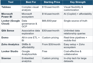
Tableau — The Visualization Gold Standard
Still a market leader in 2026, Tableau is known for its powerful analytics engine and intuitive drag-and-drop interface. Its new Tableau Agent AI assistant brings conversational analytics directly into Desktop and Prep. With unmatched visual flexibility, Tableau is the top choice for data analysts requiring maximum creative control and sophisticated dashboards.
-
Best for: Data analysts and teams with complex analytical requirements
-
Pricing: Creator $75/user/month | Explorer $42 | Viewer $15
-
Strength: Visual flexibility, large dataset handling, strong community
Microsoft Power BI — The Microsoft Ecosystem Champion
Power BI is the most affordable enterprise BI platform and is evolving into an AI-first analytics solution. The 2024 addition of Copilot has made querying data more conversational for non-technical users. Seamless integration with Excel, Azure, and Microsoft 365 makes it the go-to for organizations already in the Microsoft ecosystem.
-
Best for: Microsoft 365/Azure users, SMBs seeking cost-effective BI
-
Pricing: Pro $14/user/month | Premium Per User $24 | Desktop free
-
Strength: Affordable, AI-powered (Copilot), familiar Excel-like interface
Looker (Google Cloud) — Data Governance Leader
Looker’s Look ML modeling layer enables reusable metrics and consistent data definitions across all dashboards. Tight integration with Big Query, AI Platform, and Google Sheets makes it ideal for Google Cloud organizations seeking a single source of truth. Its governance capabilities are second to none.
-
Best for: Companies using Google Cloud, data governance requirements
-
Pricing: Enterprise from $66,600/year
-
Strength: Single source of truth, end-to-end analytics in GCP
Qlik Sense — The Associative Engine
Qlik Sense stands apart with its unique associative data model, allowing users to explore data in any direction without predefined queries. Its robust governance tools and augmented analytics investment make it ideal for large organizations with mixed technical and business users.
-
Best for: Large enterprises needing flexible data exploration
-
Pricing: From $30/user/month
-
Strength: Associative engine, machine learning, augmented analytics
Other Notable Platforms
-
Domo — All-in-one ETL + BI with real-time pipelines, mobile-first design, and social collaboration features
-
Zo ho Analytics — Best for SMBs with affordable pricing and tight Zo ho CRM/Finance integration
-
Looker Studio (formerly Google Data Studio) — Free, user-friendly, perfect for Google Analytics and Ads reporting
-
Sisense — API-first, in-chip technology for large datasets, ideal for embedding analytics in products
Real-World Use Cases
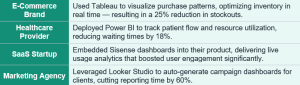
Leading organizations across industries are already seeing measurable results from data visualization investments:
Key Trends Shaping Data Visualization in 2026:
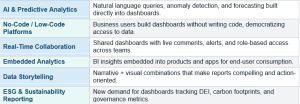
The data visualization landscape is evolving rapidly. Here are the six most important trends every data professional should know:
How to Choose the Right Tool
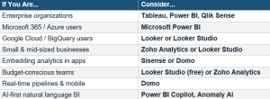
Selecting the right platform requires evaluating your organization size, team skill set, data complexity, budget, and compliance requirements. Use this quick-reference guide:
Security & Compliance Reminder: Always verify that your chosen tool adheres to relevant data protection standards such as GDPR, HIPAA, or SOC 2, especially when handling sensitive customer or patient data.
Choosing the best data visualization tool depends on your specific goals, data complexity, and the needs of your team. The right platform can unlock the true power of your data — enabling faster informed decisions, better team alignment, and enhanced customer experiences.
At Dlytica Academy, we help data professionals build the skills to evaluate, implement, and optimize the right visualization platforms. From dashboard design fundamentals to advanced analytics and AI-powered BI, our programs are designed to make your data work harder for your organization.
🌐 www.dlytica.com/dlytica-academy
📞 Canada & USA – +1 548 468 7968, +1 437 837 0325
Nepal – +977 9709152334, +977 9709152335
#ITTrainingNepal #ITTrainingCanada #InternshipProgram #CareerInTech #UpskillNow #LearnWithDlytica #DlyticaAcademy #GenerativeAI #AgenticAI #DataAnalyticsTrainingNepal #DataAnalyticsTrainingCanada #DataAnalyticsTrainingUSA #BusinessAnalytics #DataDrivenDecision #AgenticAI
